ENGINEERING DESIGN FOR EDUCATIONAL INTERFACES
Nathan Balasubramanian, Nick Joseph, Jodi Kiefer, and Isaac Sanders
(Submitted as Final Independent Research Paper and Presented on April 18, 2005)
1. Introduction
In The Sciences of the Artificial, Simon [1] identified designers as individuals concerned with how things ought to be in order to function and attain goals. From our brief review of the design literature [2, 3, & 4], and conversations with middle- and high-school students, we identified six design principles that seemed to be the bedrock. The design principles were: simplicity, consistency, usefulness, usability, accessibility, and coherence. These six design principles are necessary conditions in any good design. However, these principles largely apply to a design’s functionality while meeting user needs.
Meanwhile, in the design for learning, these six factors alone are not sufficient to facilitate learning. Learning, defined by Simon [5] as changes that allow systems to adapt and improve performance, is influenced by both cognitive and motivational issues. We need at least four additional factors; engagement, motivation, intentionality, and feedback-driven assessment to engineer meaningful learning environments. This paper describes our attempt at examining these issues.
2. Relationship and Trade-offs between the Six Design Principles
2.1 Interrelated Principles
A lot of our criteria go hand-in-hand with each other. Addressing one criterion in a design also incorporates features of the others. For example, a design that takes usability into consideration would also need to incorporate usefulness features into the design. Usability features would include clear labeling and orienting skilled users whereas usefulness would make sure that labeling and navigation tools are placed in the same location throughout the site to help novices. Another set of criteria that should be included together (an “and” relationship) would be simplicity and coherence. Simplicity deals with the basics with a simple structure, color & type styles and short text lines. Coherence goes one step further to stress the need to eliminate extraneous material such as irrelevant pictures, sounds and words as well as explanations that are more in-depth than necessary.
While most of our criteria complement each other well, moderation of each type is the key to success. For example, a design that focuses strongly on the usefulness of the system to incorporate the audience’s knowledge level and addressing their needs could impact the coherence of the system with excess information. Another example of a set of criterion that could inversely affect each other is accessibility and usefulness. Accessibility requires the use of technology that is commonly available to most users in most situations (i.e. from multiple school systems to students using their home computers). This may limit the use of new multimedia technology which, in turn, may prohibit material from being presented in many possible useful and effective ways.
2.2 Trade-offs
Meanwhile, there are trade-offs associated with each criteria. These are described below:
1. Simplicity
• Making the interface too simple takes away some of the more useful and powerful features that you could add for more advanced users.
• Simpler programming languages like java are easier to use but not nearly as powerful as languages like C++.
2. Consistency
• Making the interface consistent allows for easier navigation but again this could be restraining and irritating for advanced users. A common don’t in interface design is to make a user feel constricted. The adage to follow is: Give the user control, don’t control the user.
3. Usefulness
• Making an interface truly useful and powerful can also make the interface much more complex and less usable.
• One of the goals in good interface design is to make it accessible. The user should have easy access to the software / interface. An example of this is when Flash applications started coming out. They were very useful but it was hard for schools to acquire the Flash software and so a lot of the schools couldn’t use the applications.
• Truly useful and powerful software might not be very easily accessible.
4. Usability
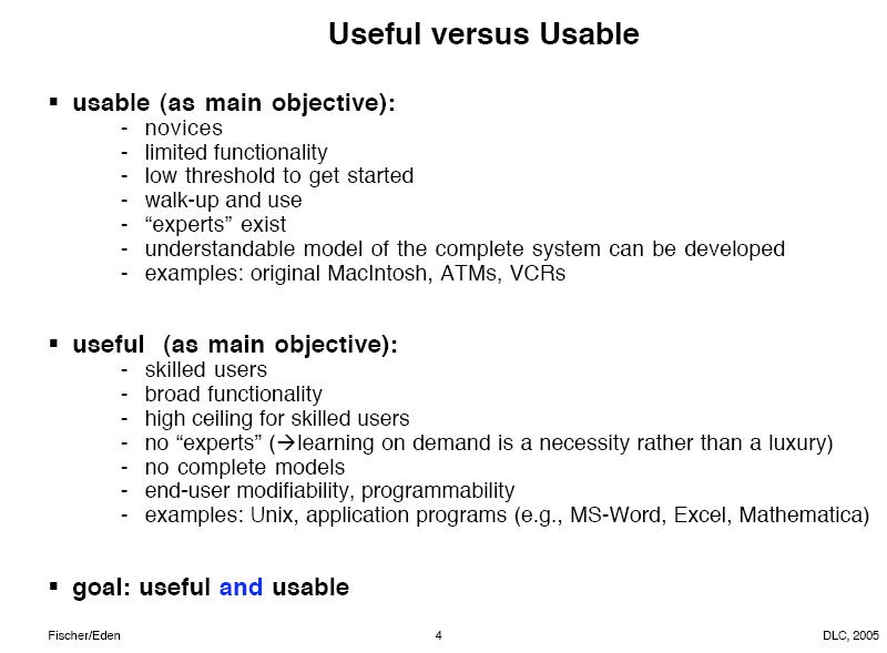
• The only drawback of trying to make an interface usable is that, once again, powerful and useful features might not be included. It’s hard to make an interface useful and usable at the same time. Fischer and Eden [6] articulate the differences eloquently (Fig. 1)

Fig. 1 The goal of good design is to make the design both useful AND useable
5. – Accessibility
• Accessible software / applications / interfaces might not be as useful as more technologically advanced applications that aren’t easily accessible.
• An example of this could be java applications. They are easily accessible because java applications can run on just about any type of hardware / operating system but don’t have the possibility of being nearly as powerful as applications designed specifically for one type of hardware / operating system.
6. Coherence
• By only adding what the user needs to see you’re limiting your interface to only one type of user. In other words the interface feels generic and therefore the user feels generic. By adding lots of features and extraneous material the user feels like the application is designed for them personally and so it becomes more usable and useful.
• Extra but more powerful features could be added by not making the interface coherent allowing the interface to be more useful, but could also be cluttering and irritating.
An example of a good design that elegantly combines these principles in the Google interface. The main page is simple and usable. For more advanced needs, users can select appropriate links from this main page.
2.3 Coherence and the SER
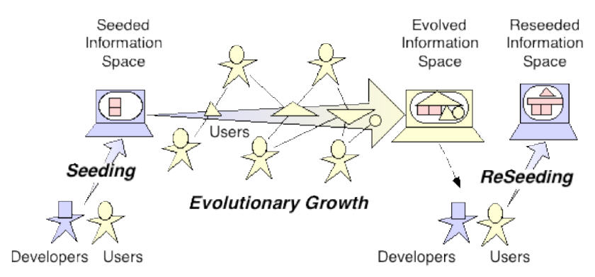
Our coherence criterion addresses issues that may arise in the reseeding phase of the seeding, evolutionary growth, reseeding (SER) model (Fig. 2) that was discussed by Fischer et al. [7]. This criterion strives to eliminate material that is extraneous to the learning purpose or goal. The reseeding phase incorporates restructuring and enhancements into the framework of the system which is guided by the changes made from the users during the evolutionary growth phase. During the evolutionary growth phase when the system is being observed and used by users and developers alike, applicable and useful content becomes apparent. This discovery helps create a differentiation between extraneous and relevant content – a distinction that is sometimes difficult to make at design time. During the reseeding phase, developers are able to eliminate material from the original system that has been deemed extraneous by users while adding additional useful content/structure.

Fig. 2 The seeding, evolutionary growth, and reseeding process model
3. Educational Considerations
When students are challenged with real-life structured scenarios and allowed to collaborate socially with other individuals during problem-solving, their conceptual understanding is enhanced. We believe, like Fischer et al. [7] that intelligence and creativity are generated and sustained through active collaboration, interactions, dialogue, and shared interests between individuals and their socio-technical environments. Besides, as Fischer et al. [8] noted, tools need to motivate their users by showing them a range of possibilities that are achievable using the tool – through examples and demonstrations.
The communities that have evolved around the use of computer technologies – such as Physlets [9] – the java applets that were initially developed as physics on-demand simulations but now extend into science education and SketchUp [10] for conceptual 3D design show how collaboration can extend the application of engineered learning environments. However, adapting these for classroom use in K-12 settings for teaching science and engineering continues to be an ongoing challenge for teachers.
In our class project, we illustrate how the four additional design principles; engagement, motivation, intentionality, and feedback-driven assessments are applied in our STRONG (STRuctured-scenario ONline Games) Project. Our design principles, as they apply to our SWIKI as an educational interface, are elaborated on in our slide presentation. The SWIKI offers numerous affordances and some inherent constraints to users. The affordances of the SWIKI include the supports with WIKI markup language and HTML to satisfy the needs of a wide range of users, the consistent navigation with the side-panel always available for the user to navigate to or away from a page, and the ease with which users can upload into the SWIKI. We make a few recommendations with regard to standardizing user contributions, including subsection navigation, and fixing a glitch in the “References to this Page” in the navigation side-panel.
4. Learning With New Media
The debate on learning with media continues to engage researchers as they examine the influence of media on student achievement. Pointing out inherent limitations in existing theories and paradigms of teaching and learning, Fischer [11] beseeched a move towards transcending the “gift-wrapping” approaches using technology. Clark [12] often described media as a vehicle that delivered instruction for learning. Just like a truck delivering groceries does not change one's nutrition, Clark observed that "many of the key issues in the debate (on learning with media) are connected to the very foundation of our reasoning about the scientific method, the design of experiments, and how we reason about what causes things to happen" (p. x). Clark charged that Bob Kozma "now agrees that there is no past evidence for a causal connection between media and learning" (p. 327). Yet, Clark conceded that researching the increased efficiency when learners process integrated visual and auditory information is worth exploring. Likewise, we believe that using new media to engage, motivate, add purpose, and assess learning through engineered design of learning environments will be productive.
5. Next Steps
The main idea we researched as a team was engineering the design of educational interfaces. Although this idea was addressed throughout the course, the articles by Simon [1], Fischer and Eden [6], Fischer et al. [7 and 8], and Fischer [10] cited in this paper directly lend support to the principles discussed above. We mentioned how we applied these design principles in our STRONG class project.
As a team, we learned a lot about engineering designs for educational interfaces. We would like to continue with our collaboration to write a paper for a professional audience to share our findings. In particular, we have not encountered much literature on the design principles that apply to engineer meaningful educational learning environments. Our independent research has not only helped us reflect and deliberate on the work we do, but also given us valuable pointers that we could use to enhance the learning experience of students.
6. References
[1] H. A. Simon, “The Science of Design: Creating the Artificial,” In The Sciences of the Artificial (3rd Ed.), Cambridge, MA: The MIT Press, 1996, pp. 1-24.
[2] C. Thorsen, TechTactics: Instructional Models for Educational Computing, Boston: Allyn & Bacon, 2003.
[3] R. E. Mayer, Multimedia Learning, New York, Cambridge University Press, 2001.
[4] R. C. Schank, Active Learning through Multimedia” IEEE MultiMedia, 1994, pp. 69-78.
[5] N. Balasubramanian, & R. Muth, (in press), Simon, Herbert Alexander (1916-2001), In J. M. Blount. (Ed.), SAGE Encyclopedia of Educational Leadership and Administration, Thousand Oaks, CA: Sage.
[6] G. Fischer and H. Eden, "Distributed Cognition: Toward a New Foundation for Human-Computer Interaction Research," Lecture Material, March 28, 2005, available at: http://webguide.cs.colorado.edu:3232/dlc-2005/uploads/9/distributed-cogn-hutchins.pdf.
[7] G. Fischer, E. Giaccardi, H. Eden, M. Sugimoto, & Y. Ye, (in press). "Beyond Binary Choices: Integrating Individual and Social Creativity," International Journal of Human-Computer Studies, Special Issue on Creativity (Eds: L. Candy and E. Edmond), 2005, available at: http://l3d.cs.colorado.edu/~gerhard/papers/ind-social-creativity-05.pdf
[8] G. Fischer, E. Giaccardi, Y. Ye, A. G. Sutcliffe, & N. Mehandjiev, "Meta-Design: A Manifesto for End-User Development," Communications of the ACM, 47(9), pp. 33-37, 2004 available at: http://l3d.cs.colorado.edu/~gerhard/papers/CACM-meta-design.pdf
[9] W. Christian, Physlets, available at http://webphysics.davidson.edu/Applets/Applets.html
[10] SketchUp – Sketch-based 3-D design, available at http://www.sketchup.com/education/
[11] G. Fischer, "Making Learning a Part of Life-Beyond the 'Gift-Wrapping' Approach of Technology," Notes from 6/96 NSF Symposium on Learning and Intelligent Systems, 1998, available at: http://l3d.cs.colorado.edu/presentations/gf-wlf/
[12] R. E. Clark, (Ed.), Learning from media : Arguments, analysis, and evidence. Greenwich, CT: Information Age, 2001.
Slides for Class Presentation
Engineering Design for Educational Interfaces

